|
|
|
Text Matters
The use of language and letterform as concept and design has its origins in
the artistic movement that rejected the idea that an artwork should depict
images or a physical object. Any presence of text in the form of letters and
words within the surface of artwork was otherwise typically associated with
authorship and provenance — something that is of archival importance in its
typical sense.
Conventionally, the use of text and images as tools of narration has been
part of the artistic traditions worldwide. The wide ranges of Indian
illustrated manuscripts are evidence of this. One can recall the hero and
sati stones that powerfully depict the valour and sacrifice along with
inscriptions. The colonial documentation of flora and fauna combined the
finest illustrations with great calligraphic notes. Further, within the
modern art movement in India, the influence of the innovative combinations
of text and image developed by Art Nouveau and Jugendstil illustrators on
Abanindranath Tagore and his contemporaries is well known. However, there
had been a historical disjuncture with the way the visual and textual
languages are perceived in conventional training in art. And the use of
textual elements made a comeback with a new outlook in the twentieth
century.
Text is a powerful tool that can evoke thoughts and draw out emotions. When
fused with equally powerful visual it can be graphically thought-provoking
and impactful. This exhibition underlines that Text Matters and explores
ways contemporary artists have engaged language and letterforms in their
practice. It presents trajectories of various artists who have incorporated,
infused and utilized text in their emphasis on ideas over visual forms.
These artists have used text as a means to address larger artistic, social,
and political concerns. By using text as the principal vehicle in their
artistic expression, they have pushed forth the boundaries that separate the
visual and text. The use of text has also led to the incorporation of newer
techniques which are dissimilar to the typical execution method such as
painting with a brush on a flat surface. From inscribing, printing, etching,
and embroidering to giving it a three dimensional sculptural and book form,
the versatility and power of the written word is explored. Intelligent
wordplay, political activism, subversion of mass media, autobiographical
citations and appropriation of form are some of the key aspects articulated
here. Artists here have engaged texts, self-created as well written by
others, not as citations, but as the central premise of their intellectual
engagement — as Text Matters.
Does the text enhance the power of visual or does visual enhance the power
of text? Or are they counterparts in the visual-textual discourse? These
questions remain to be revisited and re-explored.
|
|
|
Artworks |
|
|
|
|
|
|
|
|
|
|
|
|
|
|
 |
|
|
 |
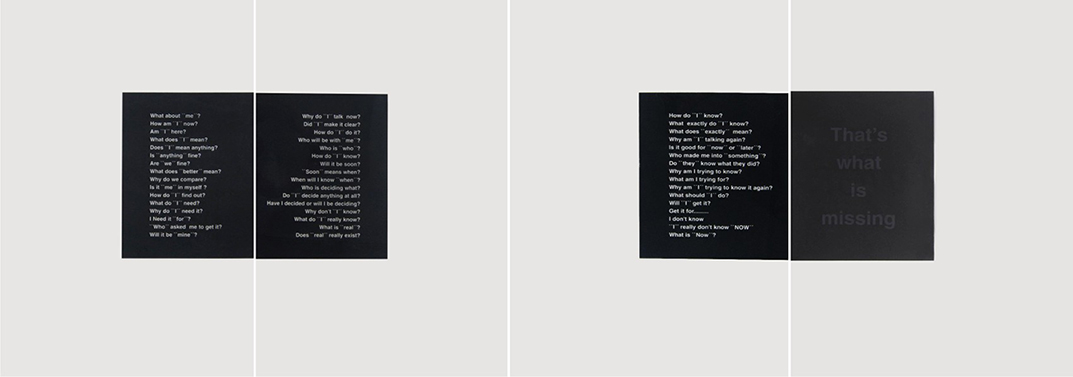
12845, A. Balasubramaniam,
That's what is missing,
Mixed media on paper, 44 x 120 inches, ed. 6/10. |
|
|
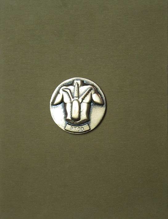
Debnath Basu and Anandajit
Ray, 2000,
Public Transport Defence Devices, Book. |
|
|
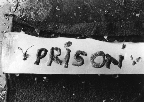
M-19, Anita Dube, Meat words
(Prison), 2006, Silver gelatin
print on fibre paper, 16.5 x 23.5 inches,
ed.1/10. |
|
A.
Balasubramaniam plays with the concept of text as image. The text and the
backdrop are deployed to play the role of pictorial elements. Composed
within the rectangular panels, the text in one of the most popular fonts
consists of a series of inquiries about self and the very existence,
culminating in an almost invisible statement that reads ‘That’s what is
missing’, thereby encouraging the viewers to interrogate their own
cognizance.
Bala’s works
challenge our sense of perceptions while creating forms that are both
invisible and intangible. He uses simple visual motifs to address larger
philosophical questions about the object, form and space. Play of light and
shade is an important aspect of his work.
|
|
|
The book titled PTDD
(Public Transport Defence Devices) collaboratively created by Anandajit
Ray and Debnath Basu consists of ten illustrated folios each featuring
drawings of imaginary devices, described and designed as a defence mechanism
to combat stress and offer comfort. The artists have chosen to execute the
idea in a book format giving it an appearance of a manual. The book mimics
the scientific manuals or a draftsman’s illustrations and descriptions from
the past. There is an underlying narrative that is witty and deals with the
mundane experience such as using of urban transport service. The text here
establishes a seemingly non-functional idea as the absolutely feasible, real
entity.
Anandajit’s body of work
is built on a strong sense of surreal imagery - be it the miniature format
paintings, painted cut-outs made as puzzles or sculptural installations.
Debnath, on the other hand, has integrated Bengali script into his oeuvre
though forms, shades and play of visibility and obscurity. This book
culminates both their artistic engagements whereas the duo’s reference to
polymaths like Leonardo Da Vinci is strikingly visible.
|
|
|
Anita Dube’s
photograph is developed from her interactive performance exploring the
movement from the body to concept. She forms words from letters cut out from
slabs of meat and invites the audience to dissect their meanings. The
photographic image captures the word, freezing the moment of its creation.
The feministic approach of seeing the body as prison is subtly evident.
In recent
years Anita has engaged with the text as her subject, using it as a
metaphorical means of expression. Her practice has involved in exploring
materials - be it the velvet and other fabrics or recycled packing
materials, that can be linked back to her association with the short-lived
but extremely important Indian Radical Painters' and Sculptors' Association
in the 1980s that challenged retrogressive art industry and commodification
of art - one of it being use of inexpensive materials and found objects in
an effort to with working-class audiences.
|
|
|
|
 |
|
|
 |
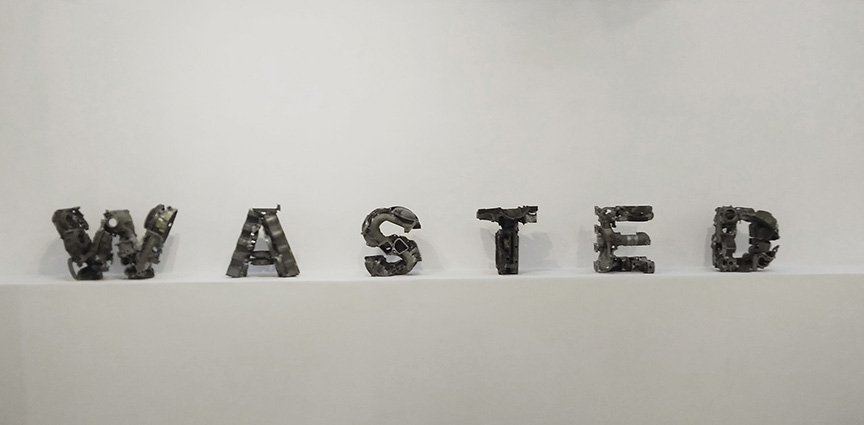
12216, Asim Waqif, Wasted,
Junked Aluminium Automotive, 15 x 104 inches. |
|
|
M-3363,
Baiju Parthan, Code, 2000-2003,
Backlit print on
polyester (Light Box), 71 x 36 x 5.5 inches
(triptych). |
|
|
5361, Bose
Krishnamachari, I wanted to be a painter and
I became Picasso, watercolour graphite on kent paper & mirror,
30 x 43.5 inches. |
|
Asim Waqif laboriously and quite literally constructs the word ‘WASTED’ by recycling
abandoned waste material like automotive aluminium junk. The word materially
and metaphorically resurrects itself from the discarded substances, strongly
stating the concerns about waste and ecological management. Not only the
word speaks for itself but the material too does.
Asim has
engaged with the vernacular systems of ecological management and issues
concerning water, waste and architecture. His art making involves
painstaking processes of sourcing material, putting together the components
to form a structure. Interestingly and paradoxically, often the objects he
creates are conceived to decay thus completing another life-cycle.
|
|
|
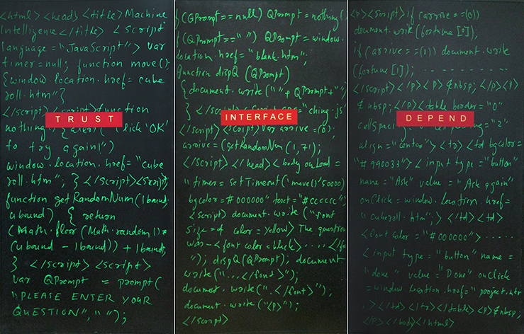
Baiju
Parthan’s panels present text as a set of codes and symbols. The three
panels are originally part of the interactive digital installation where the
code displayed on the panels running on a computer responding to user
/viewer input is the actual work. It starkly deals with the way our everyday
life’s activities are transformed into virtual data. Baiju skilfully plays
with the vocabulary based on the complex usage of symbols of the computer
programing. It offers dual possibilities of seeing the text as symbols as
opposed to that of reading.
In a bid to
ride out the fear of technology dominating our day-to-day lives, Baiju
started actively learning computer hardware technology in the mid-1990s.
This led to an altogether new encounter in his art-making - the contested
arena of human and machine relationship and the ethical and philosophical
questions arising from it. His interactive new media artworks explore this
aspect.
|
|
|
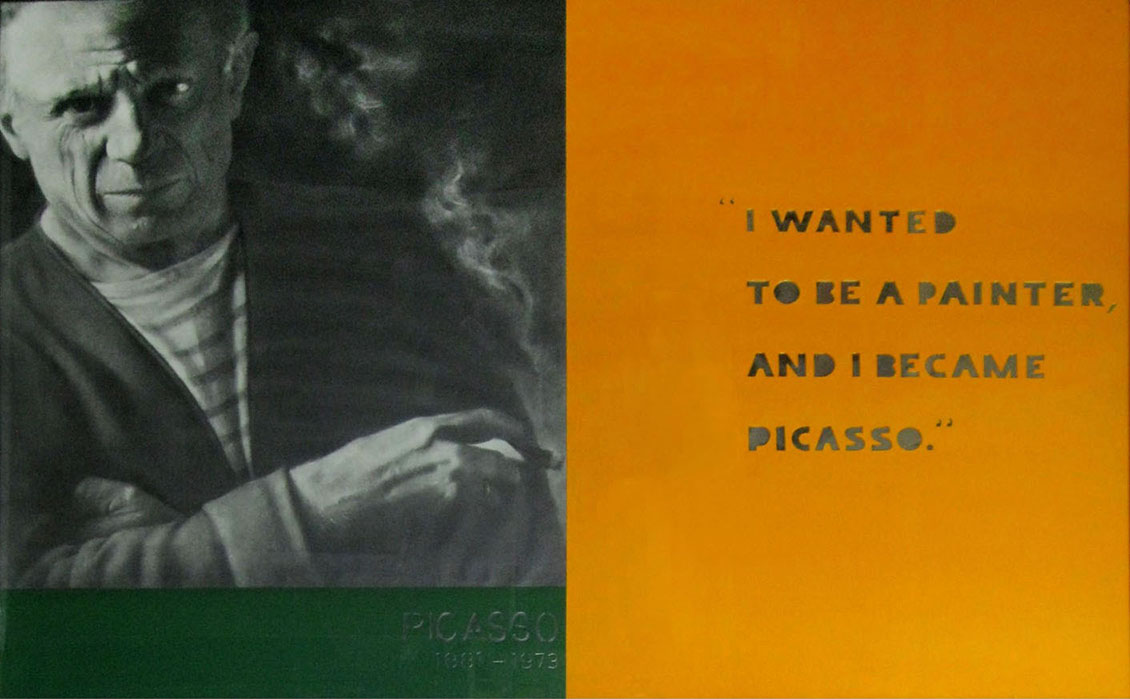
Bose Krishnamachari juxtaposes words and image in order to convey a message
that is biographical in substance. The realistically rendered monochromatic
portrait of artist Pablo Picasso and his statement become a tribute to the
icon. The words made of mirror emerge from the bright backdrop reflecting
the creator or the viewer thus also connecting the figure, the message and
the spectator.
Bose’s
significant body of work from the 1990s included canvas surfaces of flat
colours juxtaposed against skilfully executed portraits - a combination of
photographic elements and vibrant, colourful abstraction. He especially made
portraits of internationally acclaimed artists to re-emphasise that the
painting as a conventional medium was not dead. Invoking of Picasso also
reasserts Bose’s ideology in art as a global entity.
|
|
|
|
|
|
|
|
|
|
 |
|
|
|
|
|
 |
|
9994, C.
K. Rajan, Untitled, 2007, Collage, 3.5 x 6.2 inches.
10000, C.
K. Rajan, Untitled, 2007, Collage,
5.5 x 6.2 inches
10003, C. K.
Rajan, Untitled, 2007, Collage,
5.5 x 6.2 inches
10011, C.
K. Rajan, Untitled, Collage, 5 x 9 inches. |
|
|
CM-022,
Chittrovanu Mazumdar, Untitled, oil on canvas,
110 x 57 inches |
|
|
GM-03, Gulammohammed Sheikh, Book of Memories for Bhupen Shivmahal Sonata and
Residency Rhapsody in B Major, 2005,
Digital collage, inkjet, 21 x 354 cm, ed. 1/6. |
|
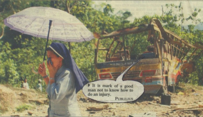
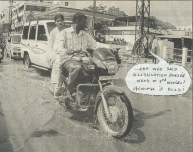
C. K. Rajan
uses images from popular newspapers and magazines and transforms them into a
new narrative with his witty statements. The hand-written text occupies the
speech-bubbles and serves as a strong commentary on India’s neo-liberal
economy. Produced between 1992 and 96, these collages are subtle yet
powerful that satirize the popular genre of comic strips.
Rajan’s
political concerns are notable in his works from the period of the 1990s
that reflect on globalisation and its impact on India.
He was the youngest member of the Radical
Painters and Sculptors Association in the 1980s, a group that stood against
the status quo within the Indian art world and the political system. These
series of work were produced soon after the disintegration of the group.
|
|
|
Chittrovanu
Mazumdar juxtaposes text alongside bold expressionistic brushstrokes. The
surface transforms into a collage-like composition that conceals and reveals
abstract forms and the text. The words playfully reversed, smudged and
misaligned challenge the viewer’s ability to read and decipher the words and
their meanings. Mazumdar plays with maximizing and minimizing the size of
the text thus inviting the viewer to read it at different distances.
Chittrovanu’s
body of work combines a variety of visual, literary and performative
references and influences. Known for his ability to traverse between the
realms of abstraction and naturalism within a single frame, he deploys
figurative imagery, elements of collage and abstract spaces to make powerful
statements on globalization, commercialization and the contemporary society.
|
|
|
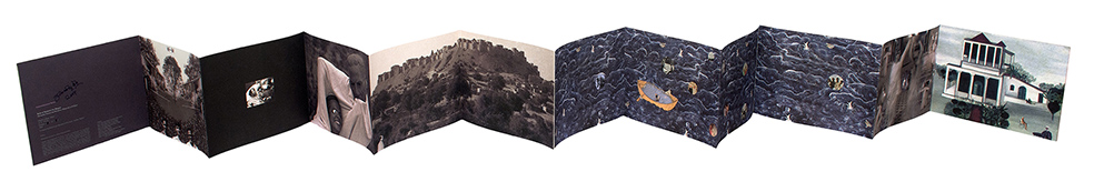
Gulammohammed
Sheikh’s ‘Book of Memories for Bhupen’ is an accordion format folder
containing photographic images forming a personal memoir of his close artist
friend Bhupen Khakhar. Sheikh employs this format as a device to bind
together the images. The captioning of it, ‘Shivmahal Sonata and Residency
Rhapsody in B Major’ encapsulate the autobiographical elements. The
intriguing aspect of this compilation is the absence of an element of the
text that overturns our conventional notions of what a book is.
This book
recalls the unconventional painting format Gulammohammed has executed such
as Kavad series, influenced from portable wooden shrine from Rajasthan used
as means for mythological narration. Unlike Kavad, the narrative presented
here illustrates the story of friendship between him and Bhupen.
|
|
|
|
|
 |
|
|
 |
|
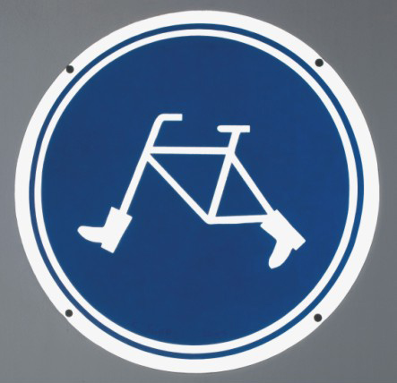
11876,
Kiran Subbaiah, Walking Bicycle, 2003, Reflective vinyl on aluminium, 38
x 38 cms, ed. 2/3. |
|
|
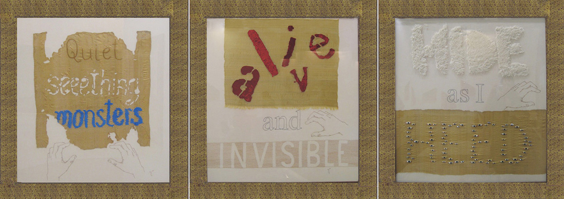
12106,
Rakhi Peswani, Body Fictions (Routing Violence), 2011, Hand embroidery
on fabrics-unbleached cotton fabric, monga silk, velvet fabric,
faux fur
and enamelled copper, 32" x 29" (triptych). |
|
|
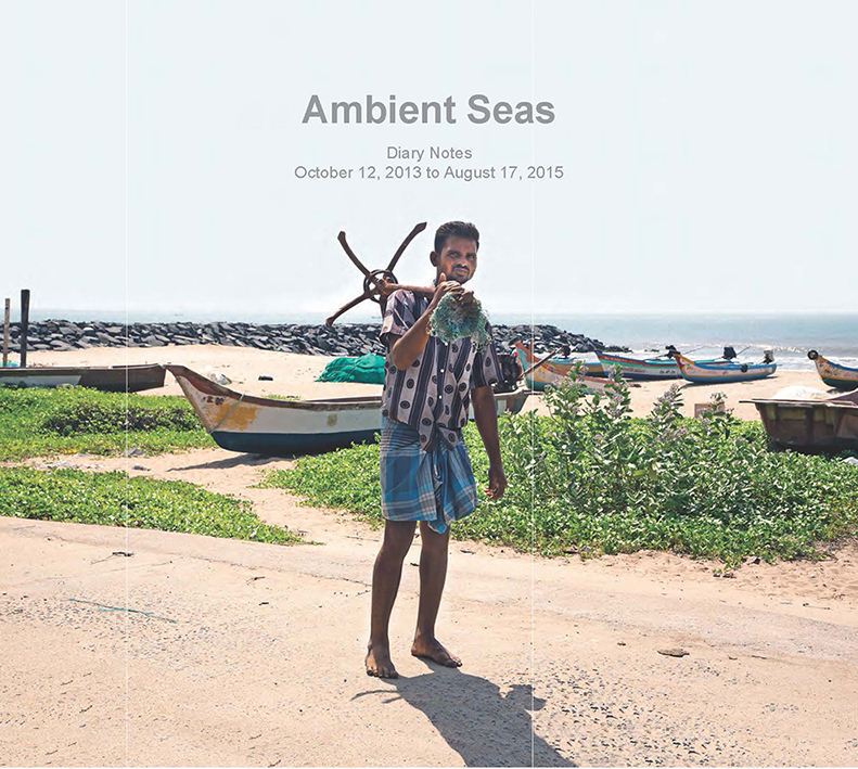
Ravi
Agarwal, Ambient Seas, Notes from October 2013
to August 2015, Diary |
|
Kiran Subbaiah playfully transforms the image of an everyday object such as
bicycle through transforming its form thereby the function. Kiran plays with
the idea of creating symbols or images to communicate messages to the
viewer, bringing in a gist of humour. He turns the image into a symbol for
signage - that does not conventionally require a text. Unlike the familiar
signage that are meant to provide information (about something that exists),
the object in this signage here tickles our thought by its impossibility of
existence.
Kiran’s practise encompasses acute observations on the material world that
surrounds us. He tactfully plays with the relationship between the form and
function of objects by intervening into the aesthetic of their making and
the usage, in turn liberating them from their actual function.
|
|
|
Rakhi Peswani explores meanings and metaphors from a set of selected words in her
hand-embroidered fragments of fabrics titled Body Fictions (Routing
Violence). Set in a triptych these words that resonate violence are cut,
stitched, burnt, and stencilled. She invites the viewer to construct words
from the combination of these disparate rhyming words in order to create a
fiction. Body and its haptic association with fabrics become a space of
reflection and creation of fictions.
Through her
practice that does not necessarily fall under the rubric of art or craft,
Rakhi has been exploring the association of labour and craftsmanship
employing everyday objects, materials, and experiences. Body and its
associations with mundane objects have been a significant theme in her
creative engagement. She toys with the tendencies to construct metaphors by
creating/ re-creating objects from materials that are dear to the body. She
often employs text in the form of words or quotations to emphasize the
message.
|
|
|
Ravi
Agarwal’s diary notes titled ‘Ambient Seas’ is a combination of photographic
images and text. The photo-diary emerges out of his engagement with the
fishing community near Puducherry. His visual and textual exploration into
the community’s cultural and political relationship to the sea forms the key
subject of the book. The visuals and the text complement each other and
present evocative personal insights.
Ravi’s
practice brings together environmental activism and artistic interventions.
He explores questions around ecology and society while positioning him with
multiple roles. He has worked with videos, installations, authored books,
created public projects.
|
|
 |
|
|
 |
|
|
|
|
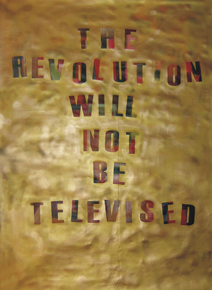
12544,
Sathyanand Mohan, The Revolution will not be televised,
2010, acrylic on canvas, 82 x 60 inches
|
|
|
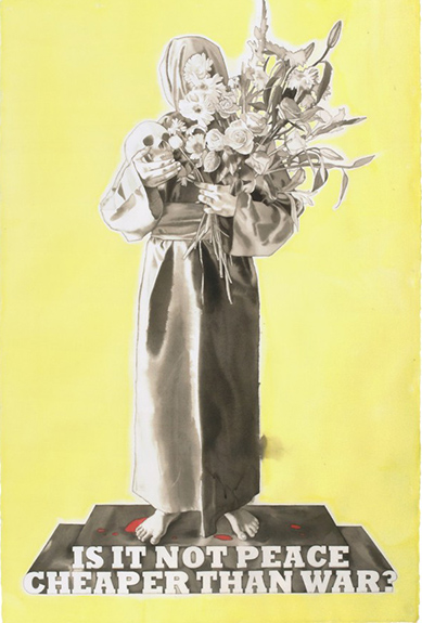
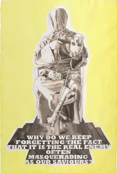
12622, T.
V. Santhosh, The Cost of the War,
Watercolour on paper,
60 x 40 inches
12623, T. V.
Santhosh, The Masquerader,
Watercolour on paper,
60 x 40 inches |
|
|
10391,
Vidya Kamat, Footnotes to Innana, 2003,
Digital print on paper, 48 x 36 inches, ed.2/4. |
|
Sathyanand
Mohan adopts the text from a spoken word performance of the song ‘The
Revolution Will Not Be Televised’ by Gil Scott-Heron, an African American
soul and jazz poet, musician, and author.
The title refers to the ways in which the real revolution - coming out of
the struggles of African American people is invisible in media depictions of
American life. The floating painted text is exposed from the bright
backdrop.
The painting
revisits the historic movement, at the same time also drawing parallels with
the use of the slogan in popular culture worldwide.
It also calls attention to the invisibility of political suffering and
struggle and our collective blindness to it
— that is a
frequent phenomenon in many cultures. Sathyanand’s many of the works draw
political and philosophical references from other cultural contexts.
|
|
|
TV Santhosh’s
employs text in the form of questions that are philosophical and universal
in his watercolours that cites the genre of posters. The questions painted
in an elongated three-dimensional style font become the pedestals for the
characters who pose holding a curious set of objects, with their faces
peculiarly covered. These figures impersonate the question which is put
forward. These sculpturesque compositions evoke a sense of awe and question
our sensibilities of how we comprehend war and terror.
Santhosh’s
practice has engaged with complex histories of violence, injustices, war,
and terrorism. His interpretative style and technique combine to expose
hidden symbolism within the margins of his work. His images surpass the
national and cultural boundaries and attain a universal stature and put
forward the unresolved questions back to us.
|
|
|
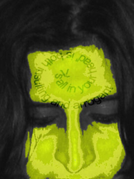
Vidya Kamat
incorporates writings by Arundhathi Subramaniam and Gita Chadha into her
genre of work that explores the issues of gender and femininity. She
reinterprets the texts that deal with the critical aspect of menstruation
and contemporary discourse around it. Set within the self-portrait of the
artist, the text here becomes a part of the body and the self. The text
visually converts the image of the body into a talking body that conceals a
lot of stories.
Vidya has
engaged with the concept of the female body as a site of varied experiences
in her practice. In order to express this, she portrays herself in different
characters - ranging from mythology to the mundane, commenting on
sensuality, beauty, and valorisation. She brings in her personal experiences
to create intriguing images that are self-reflective.
|
|
|
|
|
 |
|
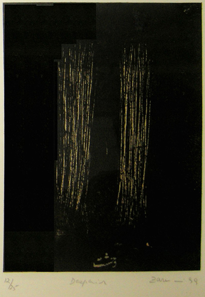
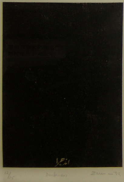
M-3059,
Zarina Hashmi, Despair-12/25, 1999, Woodblck print on handmade kozo
paper laid on Somerset paper, 8 x 6 inches.
M-3063,
Zarina Hashmi, Darkness-12/25, 1999, Woodblck print on handmade kozo
paper laid on Somerset paper, 8 x 6 inches. |
|
|
CP-1,
Canadian Government Motion Picture Bureau Electrolytic
cells - Zinc Cars on the right, loaded with Zinc. Cathode sheets,
ready for the Melting Room, Zinc Mining, Plant at Trail,
Province of Britist Columbia, Canada. |
|
|
CP-2,
Canadian Pacific Railway Company Communications
Operating Room |
|
Zarina
Hashmi’s minimalistic and abstract woodcut prints emphasize how visually
evocative words can become. Part of the set of thirty-six
woodblock
prints
titled Home Is a Foreign Place, each print features a
monochromatic
pattern derived from Urdu words like ‘Darkness’, ‘Despair’, ‘Wall’ and
‘Distance’ and so on. Zarina got them written in traditional Nastaliq script
by a calligrapher in Pakistan and developed images incorporating them into
her composition.
For Zarina,
who was relocated from her hometown Aligarh to Pakistan after the partition
in the 1950s and had been constantly moving to different places around the
world, before making New York her home, this set is like a chronicler of her
life. The prints poignantly touch upon the themes of home, borders, and
journey. They become citation ground for articulating the sense of loss and
the distance from language, her mother tongue Urdu caused by the
displacement. The words are reminiscent in their poetic meanings.
|
|
|
The
authorless texts inscribed on the press prints contain notations and
markings intended for official purposes. Reading the ‘unintentional texts’
that typically describe the content captured on the reverse in the context
of artistic explorations of text (and image/ as image) offers an interesting
dimension to the way we perceive the text. Can the text subvert itself to
offer multiple meanings? Are we seeking to find references to the
description or vice versa?
|
| |
|
|
|
|
|
|
|


,+2006&code=M-19&artist='Anita+Dube'&dimen='16.5+x+23.5+inches,+ed.+1/10'&des='Silver+gelatin+print+on+fibre+paper'&folder=Images/Textmatters/M-19.jpg&freight=3500&price=00)

,+triptych'&des='Backlit+print+on+polyester+(Ligt+Box)'&folder=Images/Textmatters/M-3363.jpg&freight=3500&price=00)


,+2011&code=12106&artist='Rakhi+Peswani'&dimen='32+x+29+inches,+(triptych)'&des='Hand+embroidery+on+fabrics+unbleached+cotton+fabric,+monga+silk,+velvet+fabric,+faux+fur+and+enamelled+copper'&folder=Images/Textmatters/12106.jpg&freight=3500&price=00)


